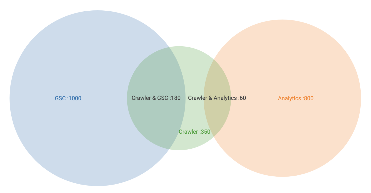
Spot issues in your crawl data with a Venn diagram on Looker Studio

Sometimes, it is hard to get the big picture of your crawl at first glance. The idea here is to benefit from the use of a specific visualisation to easily diagnose crawl data.
Introduction to Venn diagrams
Logical relation diagrams existed way before John Venn popularised the concept in the early 1880s. A Venn diagram is used to illustrate relationships between finite sets.
There are at least two circles; it can have more depending on your sets. Each circle is its own data set. Circles overlap at a certain point when they share common patterns / characteristics / values.
Venn diagrams applied to SEO
To my knowledge, the Venn diagram applied to crawl data is only used by Saas crawler Botify.
Among native visualisations, Looker Studio offers the opportunity to use visualisations from the community. These visualisations didn’t evolve that much since the launch of Data Studio; there are 40 of them available as I write this article. Fun fact: they always have been on beta. I’d be curious to know why!
This visualisation is perfect to get a proper overview of the relationships between crawl sources. We can spot URLs crawled by the crawler and found in our external data sources as well so we know that these URLs are known by all sources and among all, are easily discoverable. Then, we can easily spot URLs only found by the crawler or by a specific data source.
We want to see first the intersection so the point where the circles overlap. Then, we want to focus on the part of the circles where there is no overlap. It can be interpreted in many ways, depending your data and use case. For example, it can be old pages you don’t want to be crawled so you don’t want them to overlap with the frog. That way, you can focus on a specific action to manage them properly.
Export your crawl data
Before heading to Looker Studio, let’s get our crawl data. For this, we use our favorite frog.
- Launch your crawl and make sure to connect external data sources such as Google Analytics and Google Search Console.
- Once your crawl is ready for export, hit “Reports” and then “Orphan pages”.
- Then export “Internal All HTML” (URLs crawled by Screaming Frog).
The data can directly be exported to Google Sheets. We will use it as a data source for our Looker Studio.
Blend your exports to count the number of URLs by source. To do so, first, count the number of URLs in your Internal All HTML export (corresponding to row 4 below). Then, in your Orphan export, count the number of URLs by source. You can do it by using a Vlookup function or a pivot table.
Finally, you should have a spreadsheet with two columns:

Using the Venn diagram on Data Studio
You have now added your spreadsheet as your main data source on your brand new Looker Studio report. Now you can hit Community visualisations and then Explore more.

Venn diagram developed by First is the second to last of the list so you can scroll down to the bottom of the page. In case you need more information to use it or need to troubleshot, you can read the doc written by Joshua Sugiura from First who developed the diagram.
You don’t need a date range dimension to make sure to use Source as a dimension and Number of URLs as a metric.

And voilà!
It takes less than 10 minutes to export the data and then build the Venn diagram. You definitely can automate the process when you need to reconcile both exports (I’m too lazy to do it for you 😆).
Next step:
- Automate the above.
- Add the details of the URLs by source.
For now, enjoy folks!


Comments ()