10 advice from a Data Analyst

As we speak about data from Monday to Friday, either you’re an SEO, PPC specialist, Growth something or whatever else, I decided to partner with my talented colleague Marie Vachelard, Growth Data Analyst at Pictarine for this article.
Either it is on Twitter, Linkedin, etc. a bunch of people share tons of visualisations about X and Y but a few of them have a scientific background. A background that leads to Data Analyst / Scientist positions for instance. And I believe that we should tend to listen more to them to understand how to really analyze data.
I'm not saying we shouldn't share and talk about data when not having a scientific background. I'm saying that we should understand how to read and analyse data before sharing it.
Here’s what you can expect from this post:
- Learn to think like a Data Analyst.
- Learn methods to properly analyse your data.
- Learn how to clearly communicate the data.
- Get sample Python code to test and learn.
Before diving deep into the specifics, I would like to share a quote from Marie:
I tried to think of all the steps I need to think about before starting an analysis. If I forget one, usually something is going to go wrong.
1. Think about the big picture before diving into the data
Too often we tend to rush into the data in order to get our answers. And that's always the main reason why we fail at answering correctly. There is a real need to fully understand the brief: the question being asked behind a set of data and why. First of all, you need to make sure that you understand the data you need to analyze. How does each KPI is being measured? Is the measure working correctly? So before diving deep into the data, you need to make sure that you have perfectly understood what you will get your hands on.
- Operating knowledge: what is the business model of your organization? What does have an impact on it? How can you contribute to it through the data?
- Business rules: what are the key operations, definitions and constraints that apply to your organization?
- Data pipeline: how does the data is organized and structured within your organization?
2. Clarify the goal and context
It has to be a reason why, as a Data Analyst, you're being asked to analyze a set of data. You need to understand the reason and above all, you need to understand the context. What is the business problem? What is the purpose of the person asking for this analysis?
You also need to make sure that everyone involved in this analysis has the same understanding, lecture and expectations.
3. Understand the data
Now, you're ready to start your investigation but before writing any single line of code, you need to go through this process:
- Gather the right data: over all databases, which one do I choose?
- Ensure data usage quality: clean and transform your data.
- Remove duplicate or irrelevant observations. Especially if you work with BigQuery tables (or another tool), you are expected to keep an eye on your queries' cost.
- Handle missing data. What if some data is missing? Do you absolutely need it? Can you bypass the issue?
- Verify your data types.
- Filter unwanted outliers.
- Encode categorical features.
Reading Python code is like a story. There is a beginning and an end so the code can be read and understood by everyone. On the other hand, with Excel, it’s different because there is no defined structure but the logic of the person who created the file.
4. Explore the data
This is exactly where working with a Data Analyst makes sense. Marie has a scientific approach and methods she uses to analyze data so she can easily refers to dedicated methods to analyze this or that such as:
- Univariate & multivariate analysis.
- Descriptive statistics.
- Distribution: standardization of data, normalization of data.
- Correlation: multicollinearity, relation between variables.
- Boxplot: outliers.
5. Start simple
The simpler the better, you can be surprised how a simple regression or easy business rules can do the job. There is no need to go fancy with your code or your visualization. You can answer a lot with very simple methods. Plus, they are the fastest ones to run. By answering fast, you can help your team to iterate quickly and go further in the analysis than the very first question. That's how you can easily prove your value as well as the way you let the data speak.
6. Go further with Machine Learning
In some cases, a machine learning model is the only solution to a business problem. It is after having applied all the advice mentioned above that the Data Analyst can look into sexier methods: machine learning. Be careful and check the hypotheses under each of the models so as not to distort the analyses.
7. Have a critical thinking
Data is not only about analyzing data but more about looking past the numbers. Analyzing data is not just a simple task. Your work doesn't stop at displaying the results of an SQL query for instance. You first need to make sure that it makes sense to you, based on the goal and context you have previsously discussed about with the team. And before communicating the results, there's more to do like:
- Identify patterns.
- Extract information from it.
- Come up with recommendations.
- Come up with new questions.
By talking about the above with your team, you will be able to challenge them and together, you will be able to go the extra mile. Ask new questions, look for quick iterations and measure their impact, challenge how some KPIs are calculated, challenge the relevance of certain KPIs, etc.
8. Build relevant data visualization
A Data Analyst must create eye-catching tables, graphs, and charts to present the results to colleagues because as the adage says: an image is worth a thousand words. You won't have the opportunity to go in depth in explaining why you chose this method over that one, the whole process you went through to answer the question, etc. Plus, you will probably have to show one or two graphs at your next company's all hands. So you clearly need to captivate the audience and most of all, make your point crystal clear. So again, before looking into complex visualizations, start with the simpler ones.
9. Be curious
A good Data Analyst must be curious. Methods change quickly, it is important to keep up to date with news, trends and what other Data Analysts do. You can join a dedicated Slack community for instance, subscribe to a newsletter and so on. Something that surprised me with Marie is that one day, she came to work with an old advanced statistical book. When I asked her why, she told me: "I need to go through what I learned in school again, just to make sure I didn't forget something important and keep in mind the reason why every statistic method exists.". That's another way of being curious: challenging your own knowledge.
10. Challenge yourself and iterate
A data analysis is rarely complete. There are often many iterations between you and team members in charge of the business case who want improvements, investigate new questions, challenge the data, etc.. In addition, based on the first analyses, the Data Analyst will be able to improve the model, find more robust results and update these analyzes based on new data.
Python code to learn to think like a Data Analyst
The aim of this example is to predict the future sales by using social media ad campaign data. The data used in this example is from an anonymous organisation’s social media ad campaign found on Kaggle. You have access to 11 variables:
- ad_id: an unique ID for each ad
- xyzcampaignid: an ID associated with each ad campaign of XYZ company
- fbcampaignid: an ID associated with how Facebook tracks each campaign
- age: age of the person to whom the ad is shown
- gender: gender of the person to whim the add is shown
- interest: a code specifying the category to which the person’s interest belongs (interests are as mentioned in the person’s Facebook public profile)
- Impressions: the number of times the ad was shown
- Clicks: number of clicks on for that ad
- Spent: Amount paid by company xyz to Facebook, to show that ad
- Total conversion: Total number of people who enquired about the product after seeing the ad
- Approved conversion: Total number of people who bought the product after seeing the ad
Importing Libraries
First step when you are using a Python script is to import the libraries needed.
import numpy as np
import pandas as pd

import matplotlib.pyplot as plt
import seaborn as sns

from sklearn.preprocessing import LabelEncoder
encoder=LabelEncoder()

from sklearn.preprocessing import StandardScaler

from sklearn.model_selection import train_test_split

from sklearn.ensemble import RandomForestRegressor

from sklearn.metrics import r2_score,mean_squared_error,mean_absolute_error

import os
for dirname, _, filenames in os.walk('/kaggle/input'):
    for filename in filenames:
        print(os.path.join(dirname, filename))
Loading Data
Load your data with read_csv if your data is a CSV file:
social_ad_data=pd.read_csv("/kaggle/input/clicks-conversion-tracking/KAG_conversion_data.csv")
social_ad_data.head()
Check for null values, types of variables, number of rows by using the df.info() or df.shape code. This will help you to understand better your data before going too deep in the analysis.
social_ad_data.info()
social_ad_data.shape
Exploratory Data Analysis
Let's explore the data to have a better understanding of it. In this step, it is interesting to look at the average, standard deviation, min, max, median and correlation of your numerical variables. At this stage, you will be able to link the variables among them.
1. Numerical variables
Describe data
social_ad_data.describe()Correlation Matrix
g=sns.heatmap(social_ad_data[["Impressions","Clicks","Spent","Total_Conversion","Approved_Conversion"]].corr(),
              annot=True ,
              fmt=".2f",
              cmap="coolwarm"
             )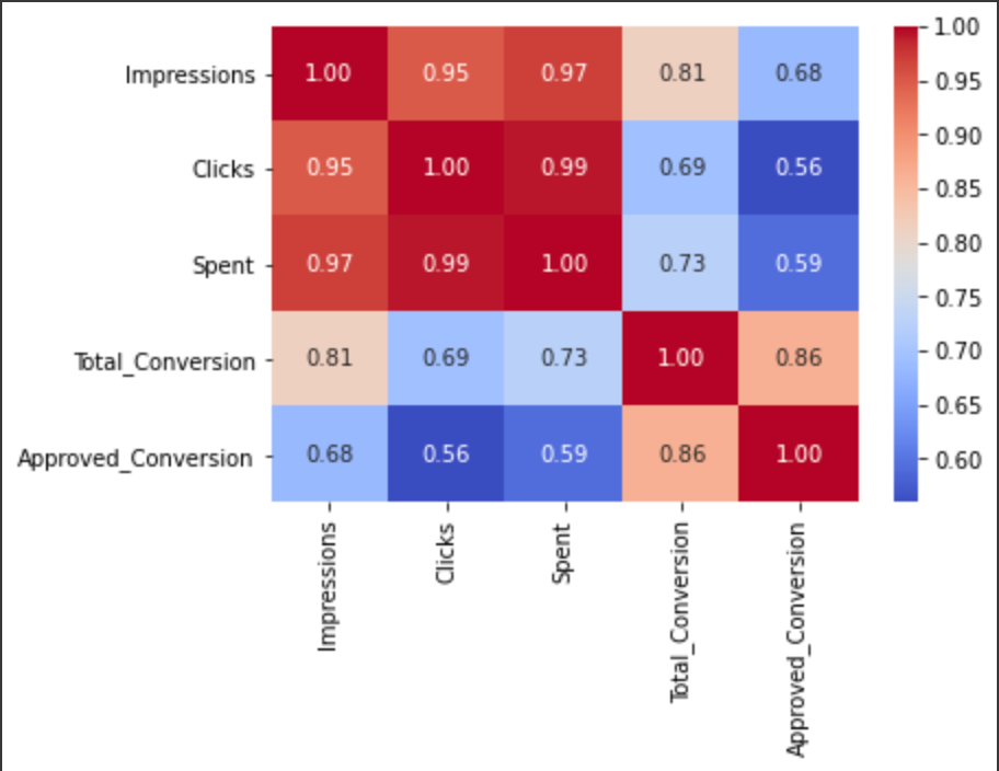
With this simple heatmap, you are now able to link the variables among them:
There is an high positive correlation between:
- Spent, impressions and click (how to read it: an increase in spent increase impressions and clicks).
- Approved conversion and total conversion.
- Impressions and approved conversion.
There is an high negative correlation between:
- Impressions, clicks, spent and approved conversion (how to read it: an increase in spent doesn't mean you will have more approved conversion).
- Clicks, spent and total conversion.
Spent description
plt.hist(social_ad_data['Spent'], bins = 25)
plt.xlabel("Spent")
plt.ylabel("Frequency")
plt.show()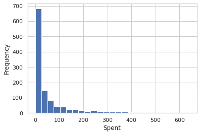
plt.scatter(social_ad_data["Spent"],
            social_ad_data["Approved_Conversion"]
           )
plt.title("Spent vs. Approved_Conversion")
plt.xlabel("Spent")
plt.ylabel("Approved_Conversion")
plt.show()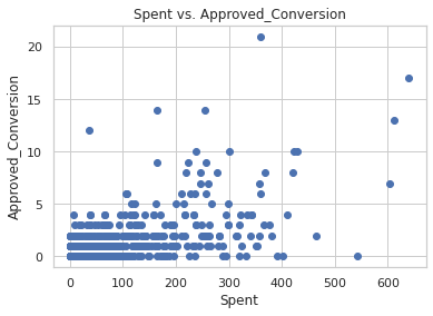
As the amount of money spent increases, the number of product bought increases. Remember, the correlation between these two variables was high negative (around 0.6). Meaning that, in this case, even if you increase your spending, the total number of purchase is not going to increase.
Impressions description
plt.hist(social_ad_data['Impressions'], bins = 25)
plt.xlabel("Impressions")
plt.ylabel("Frequency")
plt.show()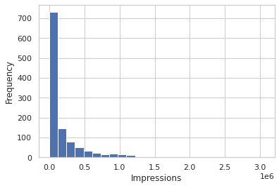
plt.scatter(social_ad_data["Impressions"],
            social_ad_data["Approved_Conversion"]
           )
plt.title("Impressions vs. Approved_Conversion")
plt.xlabel("Impressions")
plt.ylabel("Approved_Conversion")
plt.show()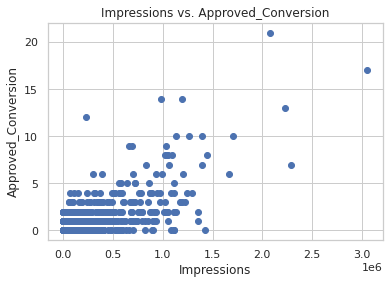
This is also clear that an increase of impressions will not increase as much your total number of purchase.
2. Categorical variables
Campaigns description
In this part, it can be helpful to understand how the campaigns perform depending on the other variables.
social_ad_data["xyz_campaign_id"].unique()Here, we see there are 3 differents ad campaigns for xyz company.
Now we'll replace their names with campaign_a, campaign_b and campaign_c for a better visualisation (which creates problem with integer values).
social_ad_data["xyz_campaign_id"].replace({916:"campaign_a",
                                           936:"campaign_b",
                                           1178:"campaign_c"},
                                          inplace=True
                                         )
# count plot on single categorical variable
sns.countplot(x ='xyz_campaign_id',
              data = social_ad_data,
              palette=['#82D173',"#FF595E", "#7C90A0"]
             )
# Show the plot
plt.show()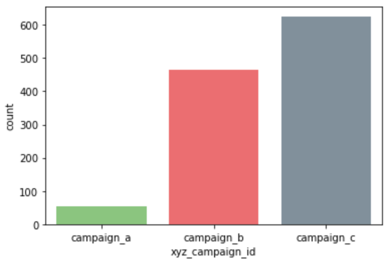
This shows campaign_c has the most number of ads.
#Approved_Conversion
# Creating our bar plot
plt.bar(social_ad_data["xyz_campaign_id"],
        social_ad_data["Approved_Conversion"]
       )
plt.ylabel("Approved_Conversion")
plt.title("company vs Approved_Conversion")
plt.show()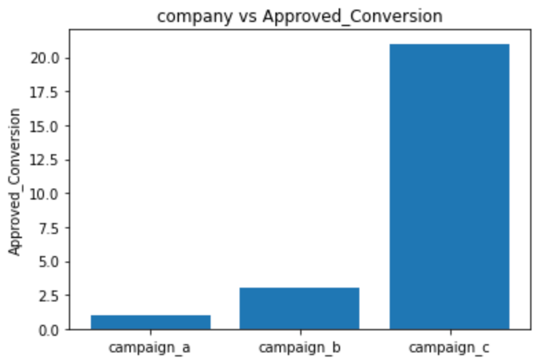
It's clear from both the above graphs that compaign_c has much more purchases (i.e. most people bought products in campaign_c). Let's see the distribution by age and gender.
Campaigns & Age
# count plot on single categorical variable
sns.countplot(x ='age',
              data = social_ad_data,
              palette=['#82D173',"#FF595E", "#7C90A0", "#4E5166"]
             )
# Show the plot
plt.show() 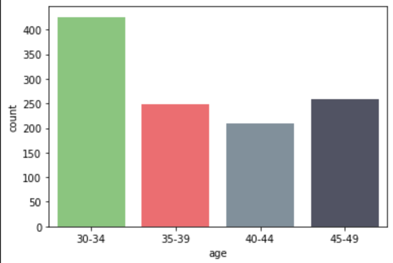
sns.barplot(x=social_ad_data["xyz_campaign_id"],
            y=social_ad_data["Approved_Conversion"],
            hue=social_ad_data["age"],
            palette=['#82D173',"#FF595E", "#7C90A0", "#4E5166"]
           )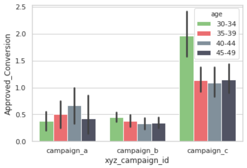
Age range [30-34] shows an higher interest in campaign c.
Campaigns & Gender
# count plot on single categorical variable
sns.countplot(x ='gender',
              data = social_ad_data,
              palette=['#82D173',"#7C90A0"]
             )
# Show the plot
plt.show() 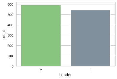
sns.barplot(x=social_ad_data["xyz_campaign_id"],
            y=social_ad_data["Approved_Conversion"],
            hue=social_ad_data["gender"],
            palette=['#82D173',"#7C90A0"]
           )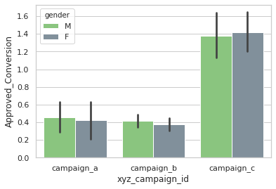
Both the genders shows similar interest in all three campaigns.
3. Focus on people who bought the product
After Clicking the ad
Let's see people who actually went from clicking to buying the product.
g = sns.FacetGrid(social_ad_data, col="gender")
g.map(plt.scatter, "Clicks", "Approved_Conversion", alpha=.4)
g.add_legend();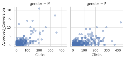
It seems men tend to click more than women but women buy more products than men after clicking the ad.
g = sns.FacetGrid(social_ad_data, col="age")
g.map(plt.scatter, "Clicks", "Approved_Conversion", alpha=.4)
g.add_legend();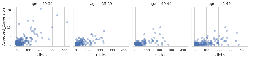
People in age range [30-34] are more likely to buy a product after clicking the ad.
After learning more about the product
Let's see people who actually went from learning more to buying the product.
g = sns.FacetGrid(social_ad_data,
                  col="gender"
                 )
g.map(plt.scatter, "Total_Conversion", "Approved_Conversion", alpha=.4)
g.add_legend();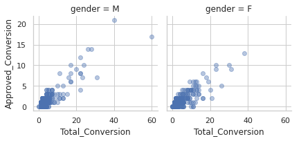
Women buys more products than men after learning more about it. However, men tends to learn more about the product.
g = sns.FacetGrid(social_ad_data,
                  col="age"
                 )
g.map(plt.scatter, "Total_Conversion", "Approved_Conversion",alpha=.5)
g.add_legend()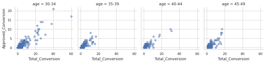
People in age range [30-34] are more likely to buy the product after enquiring the product.
Modelling
Encode your categorical variable
Replacing xyz_campaign_ids again with actual ids for modelling.
social_ad_data["xyz_campaign_id"].replace({"campaign_a":916 ,
                                           "campaign_b":936 ,
                                           "campaign_c":1178},
                                          inplace=True
                                         )
Encoding the Labels 'gender' and 'age' for better modelling:
#encoding gender
encoder.fit(social_ad_data["gender"])
social_ad_data["gender"]=encoder.transform(social_ad_data["gender"])
#encoding age
encoder.fit(social_ad_data["age"])
social_ad_data["age"]=encoder.transform(social_ad_data["age"])
Select your dependant and independant variables
Removing "Approved_Conversion" and "Total_Conversion" from dataset:
x=np.array(social_ad_data.drop(labels=["Approved_Conversion","Total_Conversion"], axis=1))
y=np.array(social_ad_data["Total_Conversion"])
Feature Scaling
sc_x= StandardScaler()
x = sc_x.fit_transform(x)
Splitting Data into testset and trainset
x_train, x_test, y_train, y_test = train_test_split(x,y,test_size=0.2, random_state=42)Random Forest Regressor to predict Total_Conversion (purchases)
Fitting the model into train dataset:
rfr = RandomForestRegressor(n_estimators = 10, random_state = 0)
rfr.fit(x_train, y_train)
Predicting Total Conversion in test_set and rounding up values
y_pred=rfr.predict(x_test)
y_pred=np.round(y_pred)
Evaluation
mae=mean_absolute_error(y_test, y_pred)
mse=mean_squared_error(y_test, y_pred)
rmse=np.sqrt(mse)
r2_score=r2_score(y_test, y_pred)
mae
Absolute Error is the amount of error in your measurements. It is the difference between the measured value and the “true” value. The Mean Absolute Error (MAE) is the average of all absolute errors. Here, the mean absolute error is 0.99. A small MAE is great! It means that between the true value and the prediction value there is, in average, a distance of 0.99.
r2_scoreR-squared value is equal to 0.753 which means 75.3% of the data fits the regression model. It's good but we could do better. To do so? Tune your model, create new explanatory variables, clean your data until it's fully pulish...
Of course, you have to present the results to your team or colleagues. Make sure to make a good presentation with catchy data visualisations. It will make the difference between a good Data Analyst and a great Data Analyst. You can use Python or any data viz tools that you have (Tableau, Data Studio...). Let's be creative and make sure that your audience will understand the message: aim and results are keys.


Comments ()